Difficulty of Icon design
The 14th puzzle is almost completed. It is a puzzle that solves a three-dimensional maze.
Front side and back side
This puzzle required new icons for the UI. Until now, there have been icons for buttons that move puzzle pieces up, down, left, and right. This time, we needed an icon to represent the movement to “front” and “back”.
In general apps, there are icons with similar meanings, such as changing the order of objects and layers to the front or back. In this game, the icon is overlaid on the play screen, so we want to make the icon as simple as possible.
We are having a hard time expressing “front/back”, which has a similar nuance to the existing “up/down”.
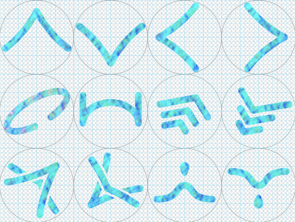
In the figure above, the top 4 icons are for “up, down, left, and right”, and the 2 right in the middle row and 4 icons in the lower row are under consideration for “front and back”. We will decide while looking at the usability of the game.
Pictogram
As an aside, pictograms, like icons, should simply convey what they are to many people.
Many pictograms were designed for the 2021 Tokyo Olympics. The design that properly conveys similar sports is amazing.
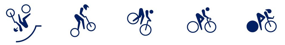
(The pictograms above are examples of BMX, MTB, road, and track)