Finding the font

In order to create a digital booklet, we opened some of the samples that came with Affinity Publisher and studied how to use them. Afterwards, when creating the booklet, we found the font used in the sample had a nice feel, so we tried creating it using that.
However, when we re-open the booklet later, the fonts are missing. Upon investigation, we found out that it is a package font that can only be used when a sample is open, and that the font cannot be used on its own. The font was called “FS Albert” and was not a free font that could be used commercially.
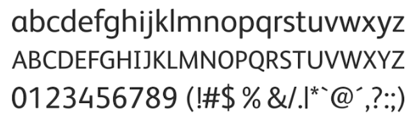
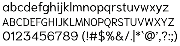
When we found out that we couldn’t use the font, we became even more concerned about the design of that font, so we looked for a similar font. We think the characteristics that make it different from similar sans-serif fonts include the shape of the ‘a’ and ‘g’ letters, the narrower width of the characters, the lower x-height, and the opening curve of the ‘c’ and ‘s’ letters. As a result of searching for fonts that come with the OS and apps, as well as Google Fonts, we decided to try using a font called “Niramit” as it had a similar feel, although none were the same.
By the way, we use “Optima” for logotypes, etc., and it’s our favorite font that we often use for other designs, but our personal opinion is that it’s a different font for the text of the hint book.